Any of us who work in the industry — or really anyone who's been using Google over the years — knows that the search results have changed radically over time. It's not your parent's SERP anymore!
These numerous changes to the Google SERPs have a large influence on the end user experience, and on your approach to SEO.
In this presentation, I take you through the evolution of the Google SERP features, and how the concept of rank tracking needs to evolve with them. Plus, I share some key facts and figures on SERP features that our team discovered in our research.
Want to dive directly into the data? Skip ahead to the research on SERP features.
Editor's Note: The following transcript has been edited for style and clarity.
Search Results Have Changes Radically
The days of the 10 blue links are long gone. Now, the Google SERP is full of various elements that enhance the end user experience — and crowd the page. Use the links below to navigate to each SERP feature to follow along with the video.
Ads
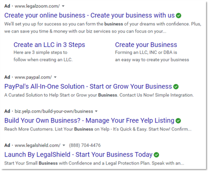
We all know about ads. Ads came in many, many years ago. They were the first encroachment into the organic search space.
Originally, they were down the right-hand side, so they really weren't in the way of the organic results at all. Many years ago, Google began to move them above and below, so now they're in line and they take up space in the search results.
So, ads were the first encroachment on that space that those of us who care about organic search had all to ourselves for the first years of Google, but they weren't the only intruders.
Featured Snippets
Another big encroachment that all of us have seen are the featured snippets. A featured snippet is simply where Google takes information from a third third-party site that they think is most relevant to the user's query, and displays it right in a box, usually at the top of the search results.
That can still get a click-through, because it's linked to the site that it comes from and the information isn't always complete.
On this example, you can see that there are ellipses at the end of each point, which indicates that there's more content there than shown. Someone might have an incentive here to click through, but still, this takes up a significant amount of space in the search results.

People Also Ask
More recently, we've seen People Also Ask boxes, which include the kinds of questions that people interested in this query also enter in to search for that you might be interested in as well.
This is of course a box taking up space on the search results page.
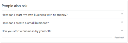
Image Blocks and Carousels
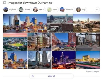
Something else that we're all probably familiar with is the image blocks and carousels in different formats — sometimes just a single horizontal line carousel or an even thicker image block as shown here.
That's just the tip of the iceberg!
The above examples are just a few of the things that Google has done to the search results page. There is an entire world more, but they may be not as visible to the average user, or even some of us who are professionals in the industry.
For a visual representation of the multitude of changes to the SERPs, take a look at this time-lapse video of the results page for the query "hotels":
Other Instances of Google SERP Features
Here are some of the other search features that we've found in our research.
Those are a lot of search features! Let's look at some examples of each and how they impact the appearance of the SERP.
Q&A Boxes
This example is only shown in India now, but we can most likely expect to see it elsewhere if it's a successful test there. These are Q&A boxes that go beyond the People Also Ask by allowing people to enter a question.
If you look at the bottom of the image below, there's a box that says "Ask the community..." and then that question goes out in a search box that other people can answer.
The functionality of this search feature seems to take on sites like Quora or Reddit.

Featured Snippet with Image Carousel Only
Below you can see an image carousel, and that is a featured snippet. If you look below the third picture, it says, "About Featured Snippets." A featured snippet can also show just a video clip.

Featured Snippet with Video Clip Only
A similar search feature is the featured snippet with only a video clip. This presents a video preview directly on the SERP, and can even divide and label the clip to show the user the footage most relevant to their search.

Featured Snippet Product Carousel with Filters
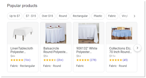
We've seen product carousels for a while. These are just different variations of them. We're seeing Google experiment with all kinds of variations in the product market.
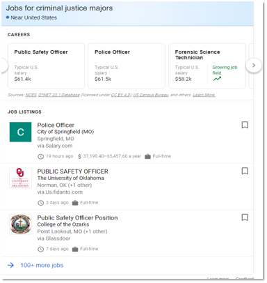
Job Pack with Careers and Job Listings
This goes beyond the normal job listings, and again, expands out the information. It resembles a local search listing, similar to a Google My Business listing.
Advanced Knowledge Graph Display
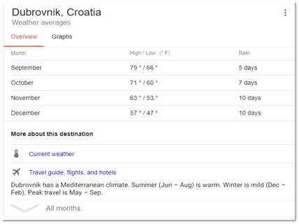
Here's a knowledge panel that goes beyond the normal extraction of information (i.e. the data that directly relates to the query that you ask) and reveals a great deal more detail and offers other links to information that you can get right within Google.
Here, we see this knowledge graph display in action for the query "Dubrovnik climate".
Find Results On
This is another feature that we're starting to see. It's an aggregate of the sites, especially these search aggregation sites (as we see below with the travel industry) that may have more information that you're looking for.


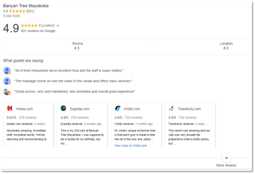
Google My Business Mobile Reviews
These have been around for a while, but they display reviews in a much richer form, as you can see at the bottom of the example.
Mobile Visual Stories
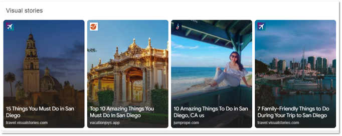
You can think of these as copies of Instagram stories that now show up in search.
Most Popular
These are things that are popular in search, centered around the query that you're searching for.
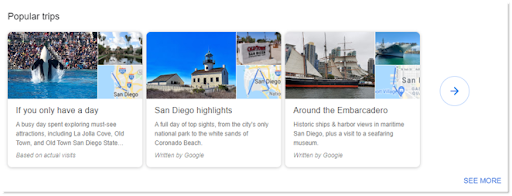
Top Questions Answered
These are the top questions that have been answered about the topic you're searching for.

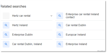
Related Searches: Old vs. New
The related search box has received some updates over the years. On the left, you can see the old way that we've been seeing it. Now it's more rich — it takes up more space again on the page.

Examples of Change: A Look at the Google SERPs
It's clear that things have changed. Let's look at how things have changed on an actual search results page.
Back in October 2016, if you searched "hotels", this is the result that you might've seen:

There are a few ads at the top, which can be expected — as we noted before, ads were already present on the SERPs in many cases. These push down the organic search results, but we still find the first organic search result on the first fold of Google.
A fold is the screen that you can see, whether on desktop or mobile, without doing any scrolling.
At least there's one organic result here in the first fold. Somebody wouldn't even have to scroll to see that organic listing.
Now let's go to October 2020:
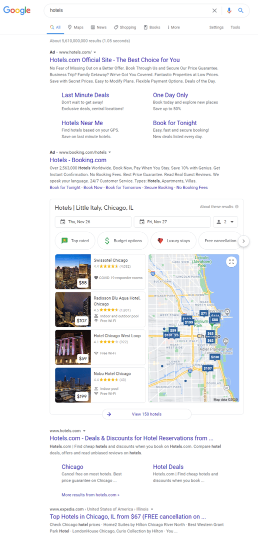
This is the same query, but notice how I had to adjust my screen to fit the SERP and to find the first organic result. There are still ads, but now there's also a whole local results box, too.
We find that the first organic web result doesn't occur until the second fold. Even someone searching on desktop like myself would have to actively scroll down before they see a single organic result.
This is not only true for search features like featured snippets, People Also Ask, ads, carousels and the others, all of which push the results further and further down the screen, but the individual organic web results themselves are now taking up more space in many cases.
Let's take a look at a search for "Capo Bay beach hotel". This is what we would have seen a few years ago:

A pretty standard Google result, right? It shows the blue link, the URL, and a little bit of richness to it with the internal site links.
A little bit later, we start to see a richer result here as TripAdvisor in this case begins using some schema.

Not only do we have an expanded blue link here, we also have ratings, we have a longer snippet, we have more information. If you compare it to the first example above, you can see that it starts to take up a little bit more vertical space.
Finally, this is how you might see that search listing today:
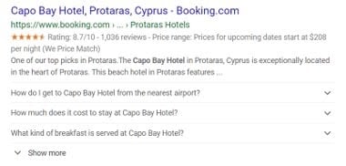
There's now a related questions included due to the implementation of the FAQ schema. Look at how much more vertical space that result takes up.
Remember our main emphasis: all of these new additions take up vertical space on the search page and push your organic results farther and farther down the page (if, of course, your listing ranks below these rich listings).
How Prevalent are These SERP Features?
As we said earlier, everything that we've shown you is only the tip of the iceberg.
Let's look at some numbers.

More than 1,200 unique search features can show up on the Google SERPs. This comes from us looking at millions upon millions of search result pages, and extracting all of the different types of features that can appear on the page.
By a feature here, we mean anything that goes beyond what we think of as the traditional organic web result (i.e. the blue link, a URL, and the short snippet). Everything from the big and obvious displays like featured snippets, image carousels, People Also Ask, and ads, down to very tiny (and sometimes hard to see) elements that are there, but are added into either the organic results themselves or elsewhere on search results page.
So we've detected more than 1,200 unique, different features that can appear. Now, admittedly, many of those show up only in special circumstances, only for certain queries, only on certain results.
In fact, we found that about 200 of these features show up on more than 0.2% of keywords — but still a significant number! There are still a lot of things that can appear on the search results page other than just your traditional 10 web results that we used to think of.
Research on the SERPs
In the study that we did on the share of visibility on search, we looked at almost 1.4 million keywords from a wide range of industries, and we found some pretty surprising numbers.
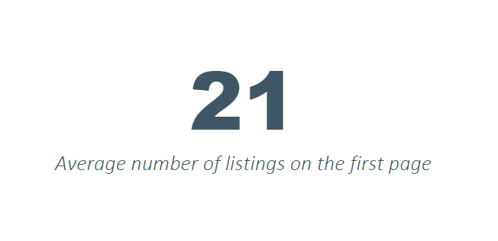
By listing, we mean any individual element on the page. That could be, again, your traditional organic web result leading to a website, or that could be a search feature like a featured snippet — anything that's unique on the page.
This is the average. So, forget about thinking of 10 elements on the page. Now, we're competing with, on an average, at least 21 different things on the page.

That coveted top spot, that number one spot of Google, in more than half of the searches we looked at, was something other than a web result.
Again, this could be anything that we've been showing you and many more that we couldn't show you, but that's pretty significant to think more than half of the time with search, it's not an organic result that's showing up at the very top.
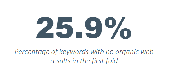
That's a pretty shocking number. For over a quarter of all of the results that we looked at, you couldn't even see an organic web result in the first fold. Somebody would have to scroll to see your first result.
This is just for first folds, forget all the other circumstances that are even worse. If you even get a single or more organic result in the first fold, you have to scroll 40% of the page, on the average, to even see it.
From Share of Voice to Share of Visibility
We need to switch our thinking from share of voice, to share of visibility. Our focus can't be just on ranking alone anymore. Now, it's all about visibility — are you even being seen?
At seoClarity, we're advising our clients to think in terms of visibility.
Share voice is the old, traditional marketing metric that's been imported into the search industry. It basically means, compared to your competition, how much often do you show up in search? You have a good share of voice if you're among the top sites that show up the most often for the keywords that matter in your particular vertical or industry.
But as we've been seeing, that doesn't mean that you're visible anymore. It's more important to see, "Are we actually visible in the SERPs?"
How to Measure Search Visibility?
How do you measure your search visibility? Everything that I'm going to show you is included in seoClarity's Visibility Share feature, available in the seoClarity platform.
Here are all different ways that you can measure your visibility on the Google SERPs:
Pixel Depth
Pixel depth shows you how far down in a pixel measurement your result is from the very top of the search result page
Here's an example of that from Visibility Share in the seoClarity platform, where you can see just a slight difference here between the singular and plural for "hoodie" versus "hoodies" for this particular domain.
![]()
For the keyword "hoodie", you can see that it's fallen on the page in terms of pixel depth — it's actually moved twice as far down the page. Whereas for "hoodies", the plural, has risen somewhat. Even without a ranking change, if the search results page changed in some way, you might be more visible or less visible than you were before.
First Fold Opportunities
Another way to measure search visibility is in terms of folds. As we said before, a fold is the part of the screen that's visible without scrolling.
It's slightly different, of course, between desktop and mobile, but it's an important measurement to say, "Are we in the first fold?" because only a small percentage of the users are going to bother to scroll down.
If you're not visible in the first fold, then you're invisible completely to those users.
In Visibility Share, we talk about first fold opportunities. A first fold opportunity is where there is at least one organic web result that can be earned within the first fold on desktop. This shows the standard first fold measurement that we use, which is a screen resolution of 1028 by 765.
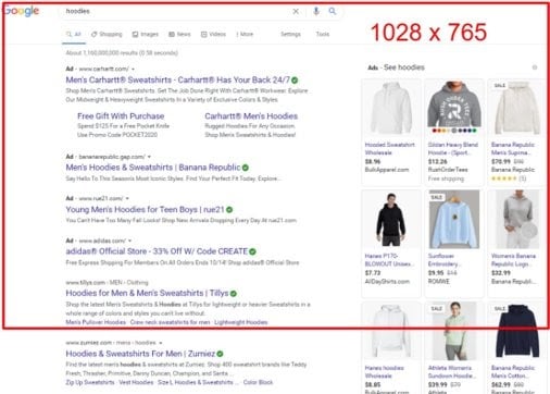
You can see in our search for "hoodies", that there's one organic result below the ads. This means there is a first fold opportunity. If you in rank position two here, you wouldn't want to celebrate that victory and go by your normal CTR percentages.
Note: our research shows that it makes a huge difference in click-through rate, not just in your rank position anymore but whether or not you're visible in that first fold.
Here we would indicate that you have a first fold opportunity if you were that second ranking domain. If you can just optimize a little bit and overtake that first position to show up in the first fold, then you have a huge advantage.
First Page Opportunities
Another way of thinking about that is first page opportunities. Here, we're looking for a particular domain at the keyword "dresses".
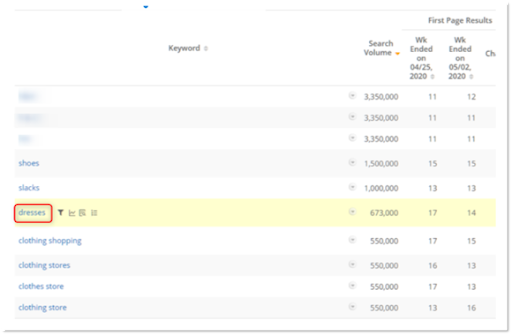
We see that in a previous week that they were the 17th element on the page. Remember we said that there's an average now of 21 elements on most search result pages. Here they were 17, but then a week later they moved up to 14.
They're within the first page, but they've moved up on that first page. This view tells you your real level of competition on a particular search page for a particular keyword.
True Competitors
Another way of thinking about this is your true competitors. Visibility Share shows you those true competitors because the clear competitors are no longer the sole competition — it's not just the other stores or the other businesses that are in your vertical. In organic search, you're competing against People Also Ask, local results, and all the other features mentioned so far.
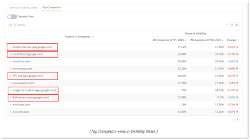
Everything outlined in red is a search feature other than organic result, and you need to start thinking of them as your competitors for organic search.
Visibility Share
And finally, what we call Visibility Share. This is the metric we're most excited about it.
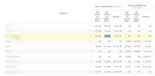
It's completely proprietary to seoClarity — you won't find anything like this anywhere else right now. Visibility Share is our proprietary metric that takes into account every feature on the page, how far down the page your result is, and weighs that against other factors that are important. Search volume, for example.
This makes it a weighted measure, expressed a percentage. The higher the percentage for your result, the more visible you are.
Case Study: SpareFoot Raises CTR with Search Features
Let's finish with an actual case study that exemplifies why all of this really matters. That is, why switching your thinking from traditional ranking thinking to visibility thinking can have real business gains for you.
SpareFoot is a leader in the aggregation of storage and moving, and they encountered a challenge with looking at very competitive, overpopulated SERPs.
They realized that a competitive SERP doesn't just mean that there are other businesses similar to theirs who are ranking against them, but that they also have to fight against the SERPs themselves, with the proliferation of all these features that we've been talking about. They felt like they were getting too low a CTR, and thus not the traffic that they would want to receive.
This was their hypothesis:
Our competitors have more real estate in the SERP. We wanted to test our share of visibility to see if we noticed an improvement in our CTR.
In other words, if they could capture more visibility, more real estate on the search results page, the hypothesis was that they would raise their click-through rate and raise their traffic.
 Click through above to read our Case Study on Visibility Share.
They decided on two tactics to capture more of that search real estate. The first was to add structured data to get more rich results. Remember that you can capture more space on the search results page not just by getting into a search feature, but also by getting richer results that expand your organic result (and push any competition below you further down the page).
Secondly, they decided to target and try to capture search features where it made sense to do so.
They used Visibility Share to find the search features that were showing up and pushing them further down the page, knowing that these may serve as opportunities to capture more visibility. They decided the two that they could most easily go after were People Also Ask and the image carousel.
What were the results?
Implementing the FAQ schema was just one of their tactics, but these are particularly dramatic results.
Hint: Click the image below to learn more about the successes from this case study.
Their organic CTR for pages where they added FAQ schema (and began to get richer results because of that), saw a greater than 20% increase in organic click-through rate and greater than 8% improvement in their rankings alone.
Conversely, they saw a decrease in about 8% in the competitors' full visibility. They were pressing their competitors down, and their competitors were not as visible. Plus, a 10% increase in the average pixel depth for their competitors. So, not only were they ranking better, not only were they themselves more visible, but they were also making the competition less visible.
Conclusion
The real question today is: how visible are you?
Not so much where you rank, although ranking still matters! Ranking moves you up the page, after all.
But as we've seen, there are so many other factors to be aware of. How aware are you of your search visibility? As you've seen, seoClarity's Visibility Share is a fantastic tool to measure that. Plus, you've seen in the SpareFoot case study that it can produce measurable, significant business results.
If you're a client, ask your Client Success Manager to show you Visibility Share. If you're not a client, ask for a demo.


Comments
Currently, there are no comments. Be the first to post one!