Comparing web pages side-by-side offers incredible value. You can confirm site changes, find missed opportunities, and even monitor the competition.
seoClarity’s Page Comparison feature allows you to do just that with a few simple clicks. You’re able to compare the content of two pages by either the URL or HTML.
Let me show you how it works, but first let’s cover the importance of this feature.
Why Would I Want to Compare Two Web Pages?
There are a few reasons to compare page content. One of my favorite use cases is checking in on the competition, so let’s start there.
Compare Your Content to the Competition
The page comparison doesn’t have to be of pages on the same site — it can be pages from two websites.
Get an inside look at your competitor’s on-page elements to see what strategies they implement that you should as well.
A good tactic here is to compare your category page to theirs. This reveals how they approach the page title, H1 headings, canonicals, content length, and plenty more.
When you compare websites, you can find both opportunities and errors on your own site.
Mobile Versus Desktop
You may have mobile pages that differ from your desktop pages. Mobile and desktop both offer unique experiences of their own, after all.
In order to compare the on-page content of desktop and mobile, you can use Page Comparison and change the user agent to run the analysis (since the pages likely have the same URL). That is, you specify the user agent used when crawling the content. One should be set to mobile, the other desktop.
Or, if you run a mobile m. site, the URL will naturally be different than the desktop version of the site (i.e. www).
QA Versus Live Environment
Before you push site changes live, you can run the HTML of the test environment through the Page Comparison feature to compare the changes to the already-live content. All changes should be reviewed and confirmed before they go live!
Page Template Comparisons
The last use case I want to cover is comparing page templates. Take product category and product pages, for example.
You should compare your product page to your category page to confirm that there’s an equal amount of SEO optimizations on each page template. The pages shouldn’t share too high of a content similarity.
Essentially, you want to highlight the differences and make sure each has unique on-page elements and is properly optimized.
How to Use Page Comparison
Page Comparison lives within the usability portion of the seoClarity platform.
Once you enter the two URLs or two HTMLs (or one of each) you select the user agent. Again, for an example like mobile vs. desktop you would change the user agent to see the changes because the URL is the same on desktop and mobile.

(A competitor analysis in Page Comparison.)
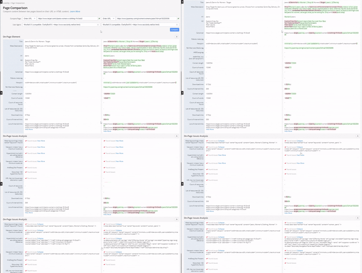
Here’s what the full comparison looks like:

(The Page Comparison feature generates a color-specified report.)
You’ll notice that the content in the left column is untouched. Think of this as your base content.
Then, the content on the right column is marked up with red or green. These colors highlight the changes. Red strikethroughs indicate content not present, green highlights indicate additional content that is present.
Recommended Reading: Monitor Site Changes (and Protect Your SEO) with a Change Monitoring System
If an element was not found at the time of crawling, then a dash is displayed.
Some of the information included in the comparison includes:
On-page elements
- Page Title
- Meta description
- H1
- H2
- Canonical
- Content Length
- Hreflang
- Download Time
- And more
On-Page Issue Analysis
- Meta description tag empty
- Hyperlinks use relative reference
- Hreflang not present
- Heading tag empty
- More than 100 hyperlinks found
All of the on-page elements help search engines and users alike understand your site, so take the time to make all proper optimizations.
Next Steps to Take
After you run the page comparison, you’ll know of the issues that you discovered in the analysis. This could be working with your Dev team to make necessary site changes, or fixing content issues that you noticed after running a competitive analysis.
Remember that this is only a two-page comparison. To really go in-depth with your pages’ elements, run a full crawl. The page comparison is a sneak peak of sorts, while using our built-in crawler can give you an in-depth, customized look at your site pages.


1 Comment
Click here to read/write comments