You hear plenty of advice about creating content for your eCommerce brand's homepage, product pages, and the checkout page.
When it comes to search traffic however, it's the content on your category pages can beat any other content type. They often attract as many, if not more, visitors as your home page. These pages act as your eCommerce brand's landing pages, driving targeted search traffic to relevant products.
Take a look at the screenshot below as an example. Out of the top five search results for the term “trackball”, one is from Wikipedia, three feature category pages, and only one points to a product.
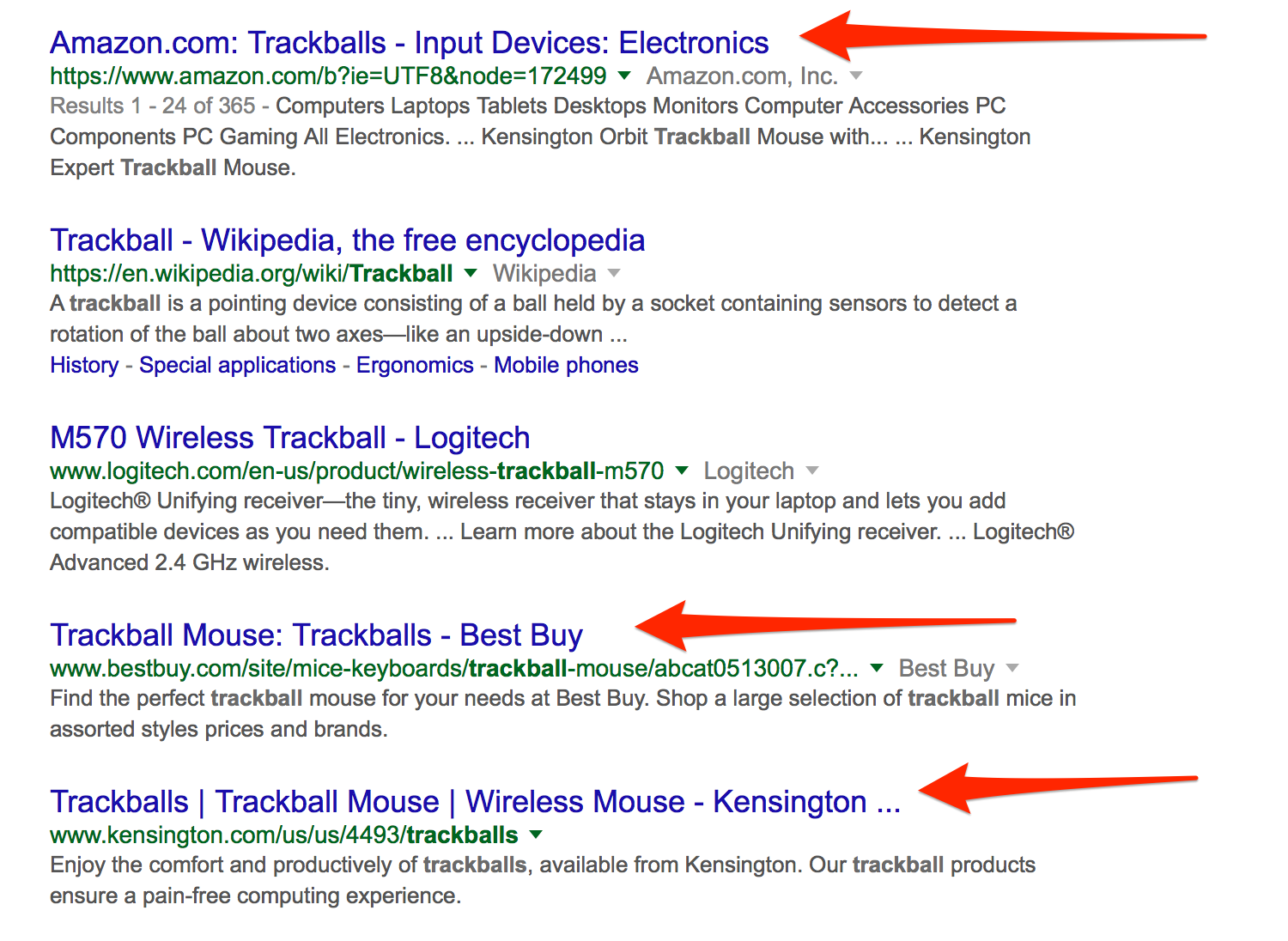
And so, it goes without saying, category pages offer you an opportunity to attract and convert visitors--but only if your content is optimized for conversions.
In this post, I’m going to show you 3 content strategies that will help you write category page content to drive traffic and ultimately boost eCommerce sales.
Strategy 1: Include Information to Match Your Visitors’ Varied Buying Intents
Customers land on a category page from a variety of sources. Many come from the search engines. Others click to it from the homepage. And many others might visit it by following a link from a blog or any other page on the site. All these people might have different reasons for visiting the page. Some do it as part of their product research, others out of sheer curiosity.
To convert them, a category page, therefore, must deliver information that satisfies those different needs:
- It immediately tells search visitors that they are in the right place and will be able to find whatever information they’re looking for on the page.
- It shows them all available subcategories they could review.
- It points them in the right direction with their search, making taking the next step in their buying journey seamless.
- A category page overcomes any previously held objections or misconceptions about your product.
- It recommends specific brands or products in which visitors might be interested.
Product listings, subcategories and featured banners--the most common category page elements--deliver only some of these objectives. For others, you need to craft compelling copy and feature additional sections that provide all the information a person needs.
I wrote about the concept of a buyer’s journey at length when talking about mapping keywords to buying intents. I recommend you read the whole description there. To give you a quick rundown:
Every person who is looking for products to buy goes through a process called the buying cycle. It includes three main stages: discovery, evaluation, and purchase.
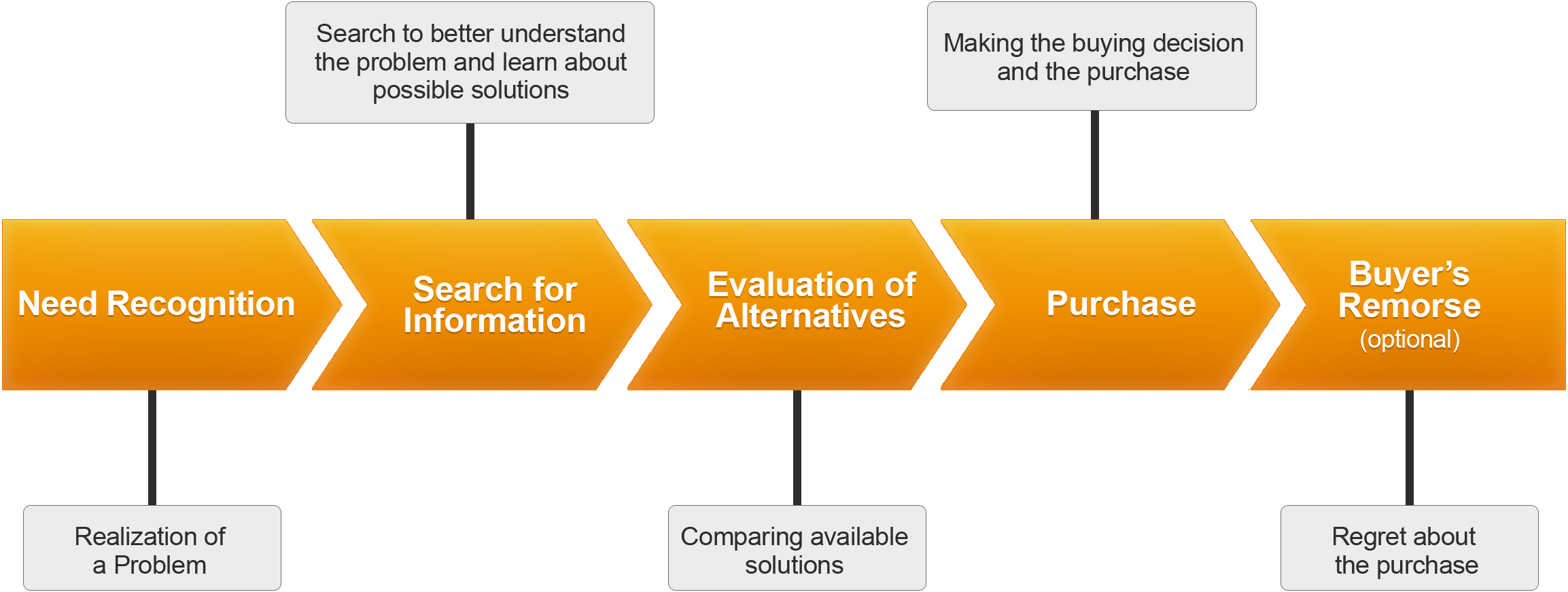
Those three stages affect the person’s search intent.
Early in the buying cycle, users seek information and advice. They exhibit intent to learn. Later, they begin to evaluate available options, moving onto intent to compare. And finally, they make a buying selection; the stage marketers refer to as "intent to buy."

Depending on their intent, those visitors will seek different types of content.
For example, people with intent to learn will want to know more about the product category, how these products may help overcome their problem, and what are the benefits of using them. They will also need help with deciding which brands, products or subcategories to look at next.
Customers looking to evaluate options will seek answers about which products would suit them better, and why.
And finally, visitors intending to buy will be looking for more in-depth information about products and subcategories.
Your category page content should deliver information matching all those intents. Here are a couple of ideas how:
- Write an overview of the category, including information about benefits of using those products, their quality, and a unique selling proposition.
- Offer buying guides visitors could download to evaluate products.
- And include advice on featured products along with proof why a person should pay attention to this specific item.
PCWorld.co.uk includes “Things to consider when buying [category product]” section on their category pages:

They also feature links to blog posts and other relevant content that delivers additional advice to visitors:
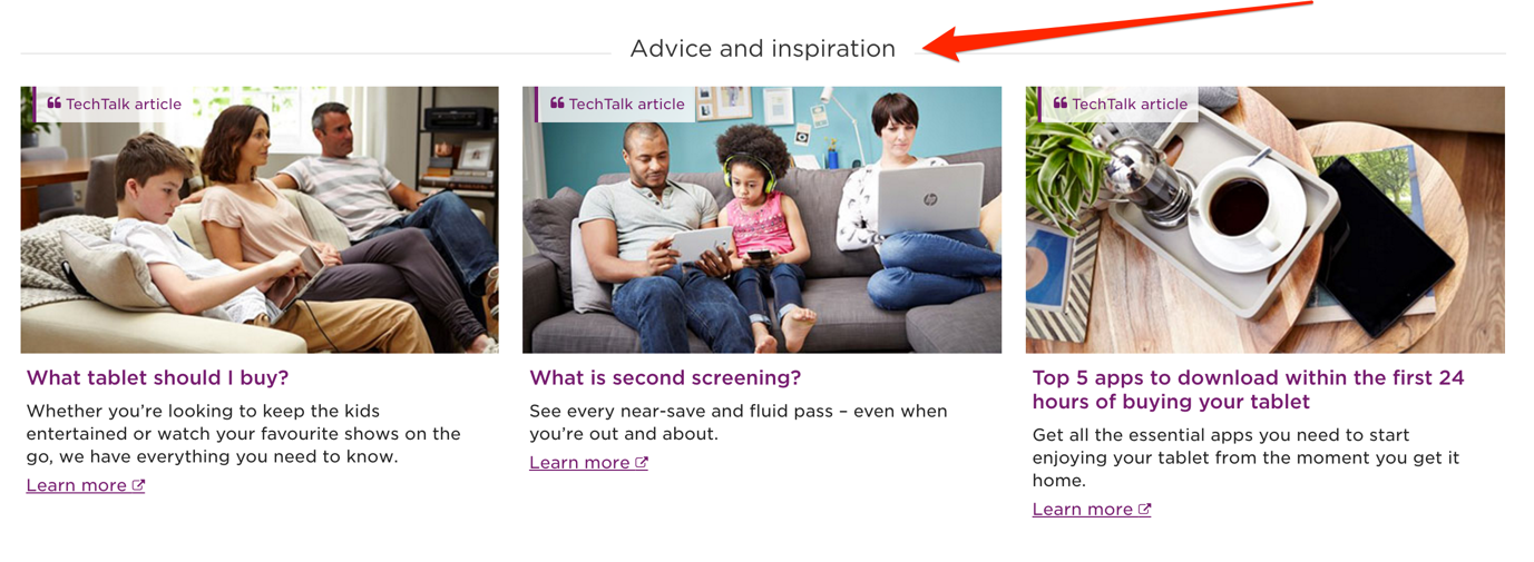
And, they include a dedicated section that helps customers evaluate and select products.
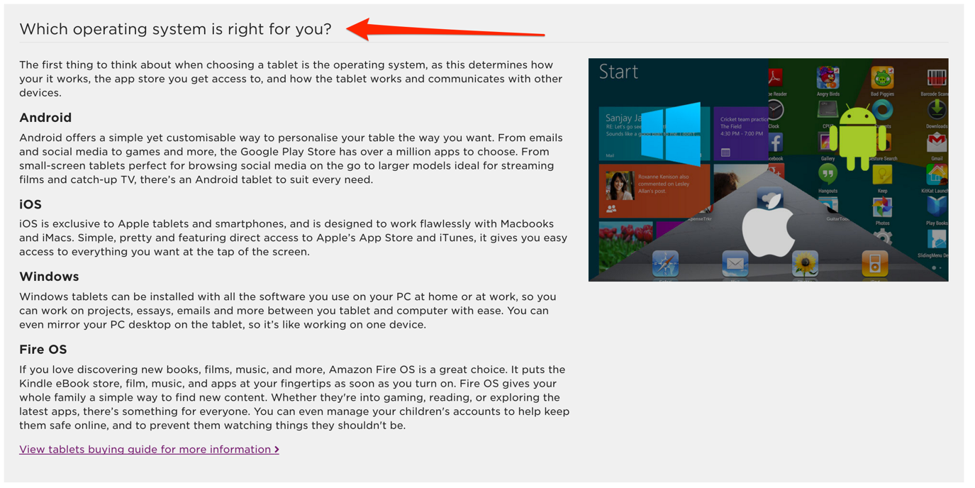
Strategy 2: Don’t Ignore the Obvious Information
Let’s face it, most customers visiting your site are busy. Even if they research the purchase from the comfort of their home, they still refuse to spend any more time on it than necessary. In particular, they don’t want to have to scour your site to find out how your store works, what payment methods you accept, what shipping options you provide or what your return shipping process looks like.
At the same, lack of this information adversely affects conversions.
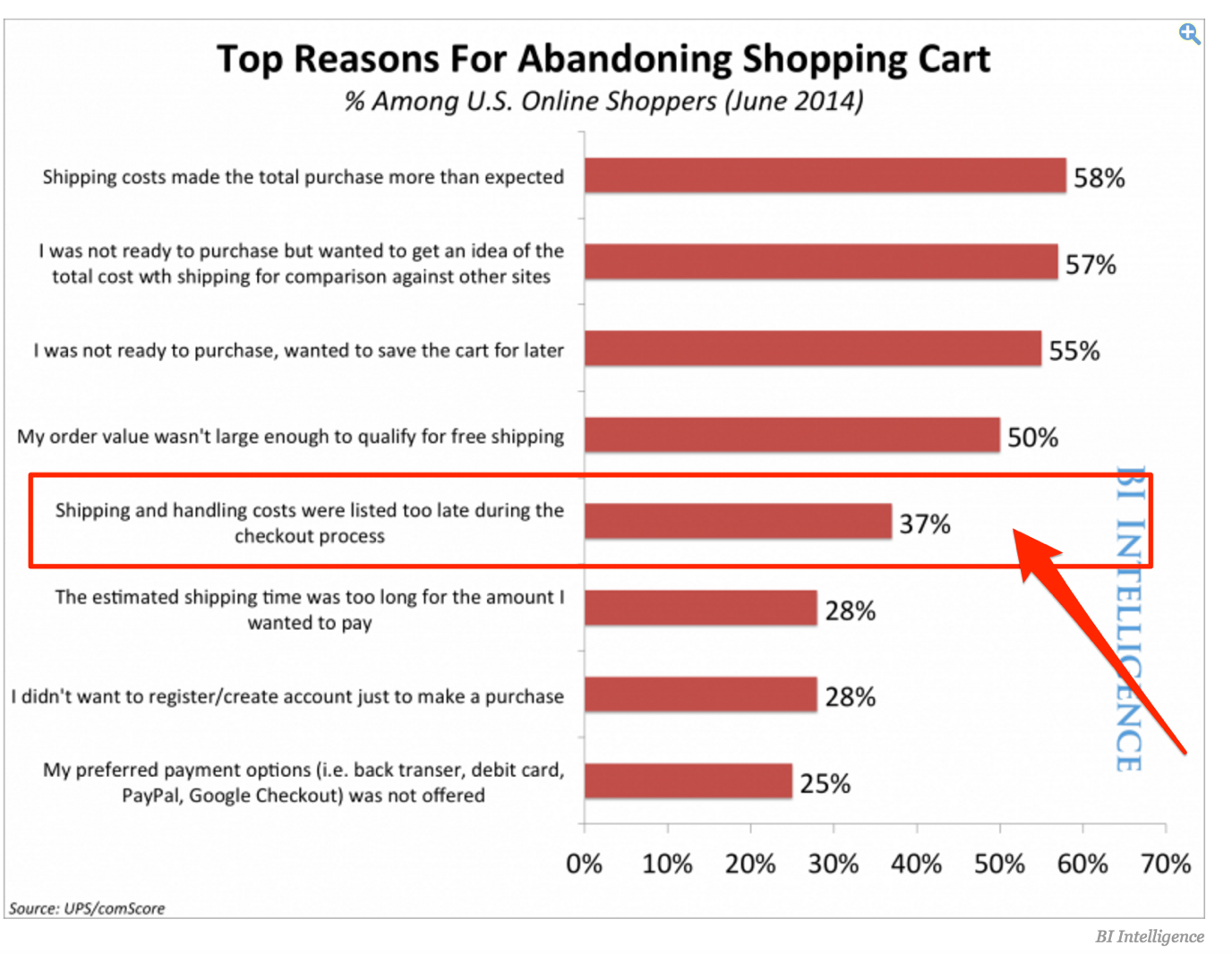
For example, according to BI Intelligence, 37% of buyers abandon the purchase because they couldn’t find shipping costs while searching for products.
Therefore, include all this information on the category page. For the most part, you won’t have to write much additional content to do so. You could communicate a lot of it using visuals.
For example, you could include icons of payment methods you accept. Place a short note stating where do you ship (i.e. Shipping products worldwide). Or include links to terms and conditions and returns pages in the copy.
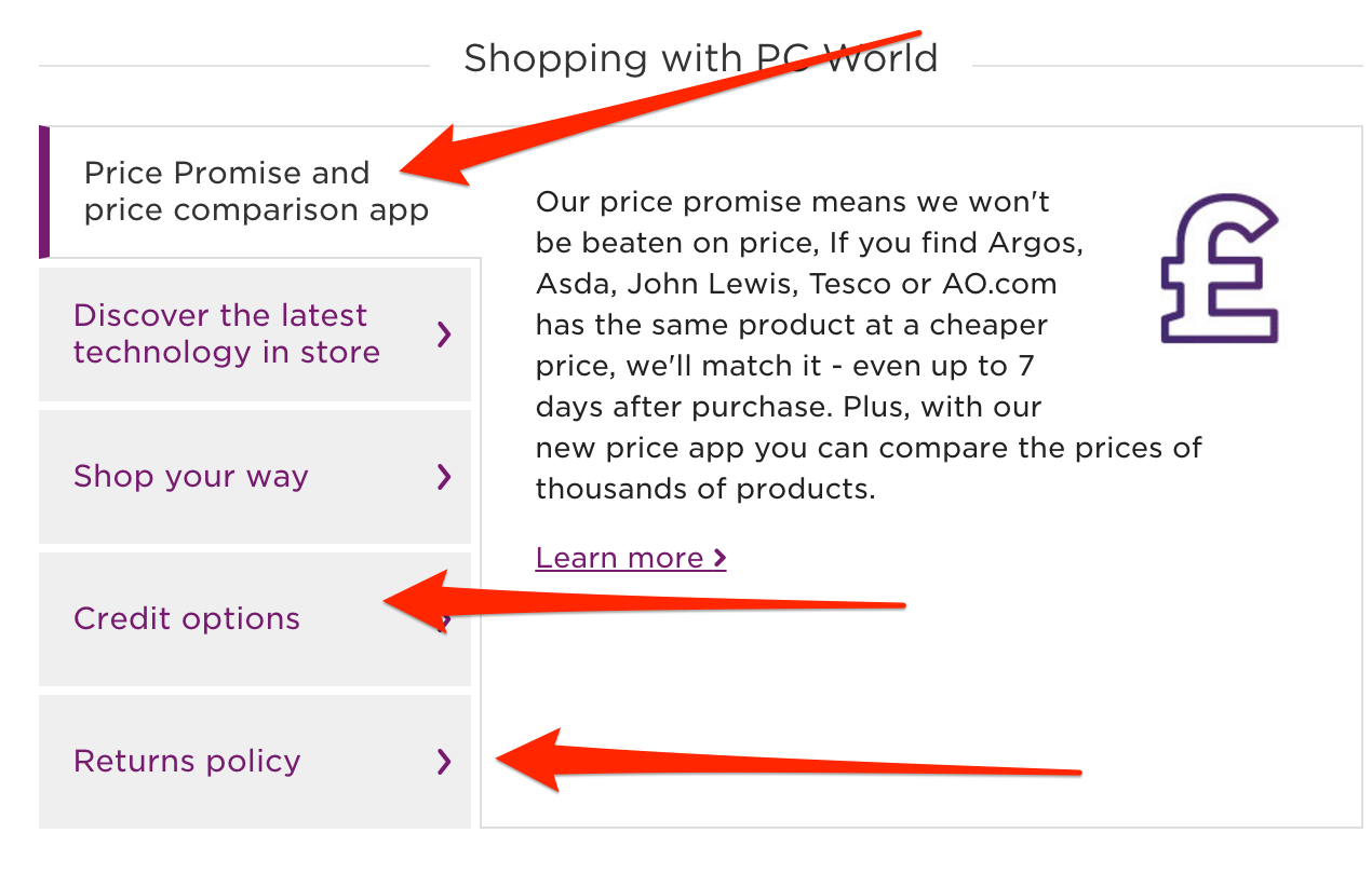
Using PCworld.co.uk as the example again, the company features T&Cs section at the bottom of every page, helping visitors find information about buying from them.
Strategy 3: Link to Other Categories and Products from the Content
Category page visitors need a lot of help from you. We’ve talked about this already. I mentioned that they need a brand, product or subcategory recommendations.
One way to do it is by including relevant links in the navigation as well as product listings, but I don’t think it is the most effective way.
Why not? By not including links to those pages from within the copy, you rely entirely on a person to decide what to pursue next.
By mentioning them in the copy, and by using a relevant anchor text (ideally featuring the brand or subcategory), you take control and guide a person in their purchasing journey.
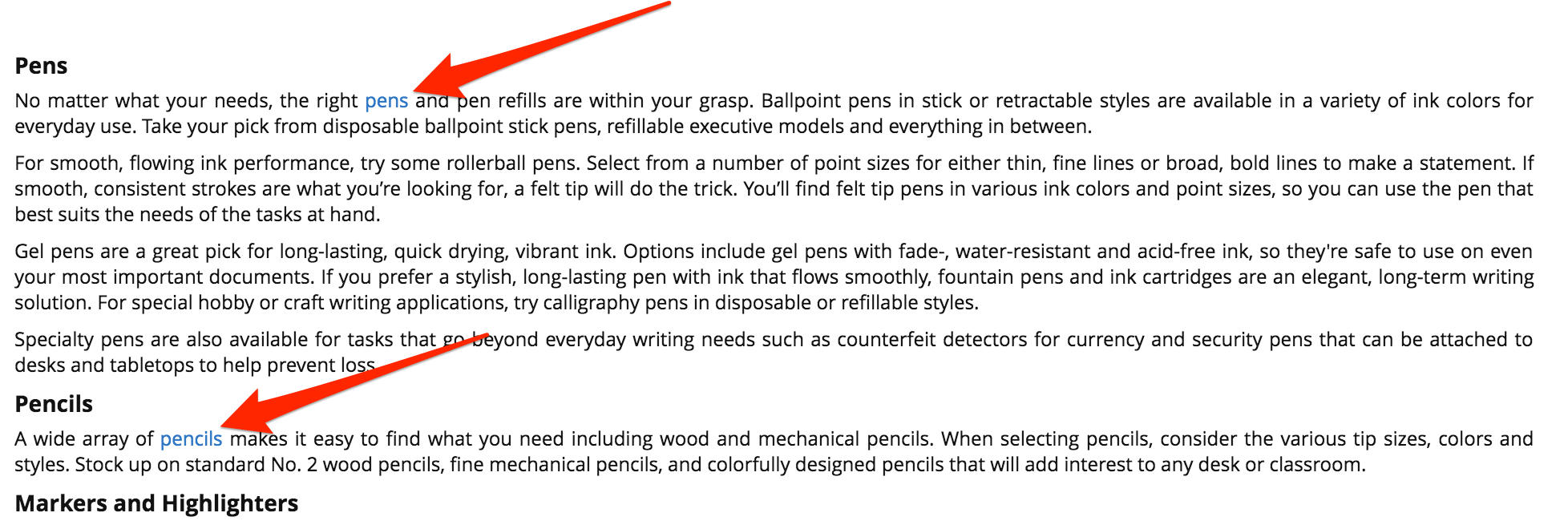
Office Depot uses this strategy to point users directly to subcategories.
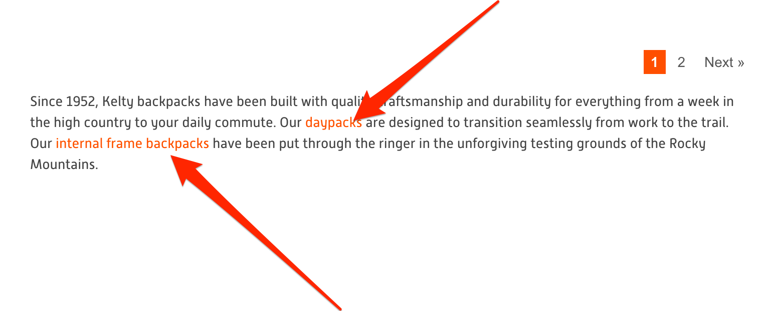
Kelty, although featuring very little copy on their category pages, uses interlinking to point users further to specific types of products with a category.
Conclusion
When it comes to search traffic, category pages are as important, if not more, as a home page or product pages. They act as your store’s landing pages, attracting visitors at various stages of the buying cycle.
Therefore, to convert them, your category pages need to feature content that matches every visitor’s intent, helps overcome their objections, and directs them further into their path to purchase.




Comments
Currently, there are no comments. Be the first to post one!